Option Trade Outcome Probability Chart
The Outcome Probability Chart provides an alternate view of a trade. Conventional risk charts show trade profitability as a function of price. That's easy enough to understand, but does not lend itself to understanding the likelihood of different P/L outcomes. For example, a risk chart on a complex trade may show several different price ranges at which a trade's profit exceeds $1000 - but how do you ascertain the overall probability that the trade will end within one of those ranges?
The Outcome Probability Chart answers that question by plotting the P/L data by probability: how probable is a $100 profit, a $1000 profit, a $5000 loss? It's telling you the same information as the risk chart, but in a way that better illustrates the probability of different outcomes.
From the risk chart, you can launch this analysis from the menu and selecting the first menu choice - to run a Trade Outcome Simulation for the date currently being displayed in the risk chart.
After you choose that menu item, a simulation configuration dialog will present an option about "outlier values" - leave that value alone for now (see the FAQ for a discussion of this option), and press OK to start the simulation. When the simulation completes, it will show you a view of outcomes and probabilities that present a useful, alternate view of the trade.
To illustrate, let's begin with a risk chart for a covered call:
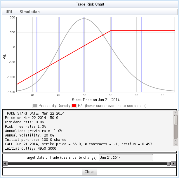
For a risk chart like figure 9, it's easy to understand the probability of various outcomes: the value of the trade increases monotonically with the price (subject to a maximum gain), so finding the probability of any P/L target using the flyover is easy.
But let's take an alternate view - organized around the probability instead of the stock price. When we launch the simulation, the calculator generates the Outcome Probability Chart by simulating a large number of price paths, and plotting the resulting probability of the outcomes. Here is the Outcome Probability Chart for the same trade shown above:
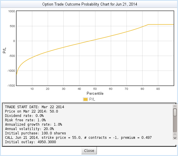
In figure 10, the Y axis shows the Profit/Loss of the trade, while the X axis shows the probability distribution of the outcomes. We see, for example:
- The breakeven point, P/L = 0, occurs at around the 45th percentile. That is, 45% of price paths end up below breakeven, and 55% above breakeven. In other words, there is a 55% probability of breakeven.
- The trade reaches its maximum P/L at around the 83nd percentile. That is, 83% of paths end up below maximum P/L, and 17% end up above. That is, there is a 17% probability of reaching the maximum P/L.
If you compare these results to the risk chart, you'll see that they correspond closely to information you can learn from that chart - but the data is organized around probabilities rather than prices.
As you move the mouse over the plot, you can see more details about the points on the plot:
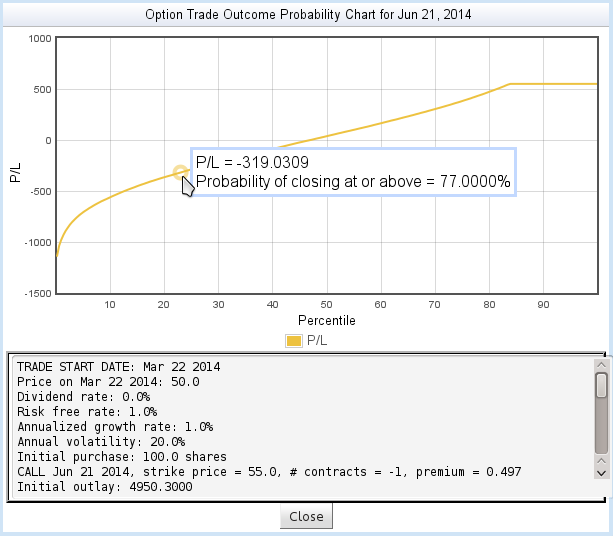
Finally, the scrolled text area at the bottom displays details about the trade and some useful statistics from the simulation:
- Mean price
- The average closing price of all the simulated price paths.
- Mean P/L
- The average profit/loss resulting from all the simulated price paths.
- Probability of breakeven
- The probability that the trade ends up with P/L of 0 or greater.
A More Complex Trade
In the first example, we learned information from the Outcome Probability Chart that could as easily be learned by studying the risk chart. To better illustrate the power of the Outcome Probability Chart, let's look at a more complex trade - a calendar spread:
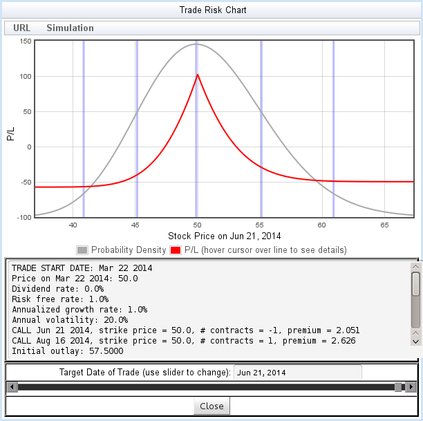
The calendar call spread shown in figure 12 has two breakeven points, a sharp peak at the maximum gain, and a sharp P/L dropoff within one standard deviation of the peak. What is the probability of success with this trade?
The outcome Probability chart provides a view that helps answer that question:
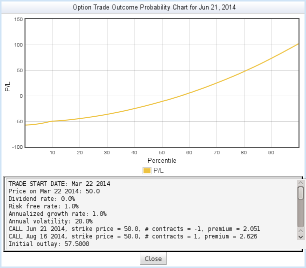
Despite the sharp curves in the risk chart, the Outcome Probability chart shows a fairly smooth relationship between P/L and probability of outcome.
Understanding the Full Trade
But something is missing from the most recent example. We've studied the trade up to the first option expiration. Then what happens?
Studying the trade beyond the first expiration requires making some assumptions about what happens when the option expires. The result of these assumptions cannot be represented in a risk chart, but can easily be shown in the Outcome Probability Chart. To learn more, visit the documentation on Analyzing the Full Trade.
What is this Simulation Actually Doing?
Please read the Theory of Operation for more detail about the math behind the option risk calculator.
Home • Starting Out • Risk Charts • Outcome Probability Charts • Analyzing the Full Trade • Theory of Operation • Contact Information • Frequently Asked Questions
DISCLAIMER: This risk calculator is for educational purposes only, and is not intended as a basis for trading decisions. Use at your own risk.